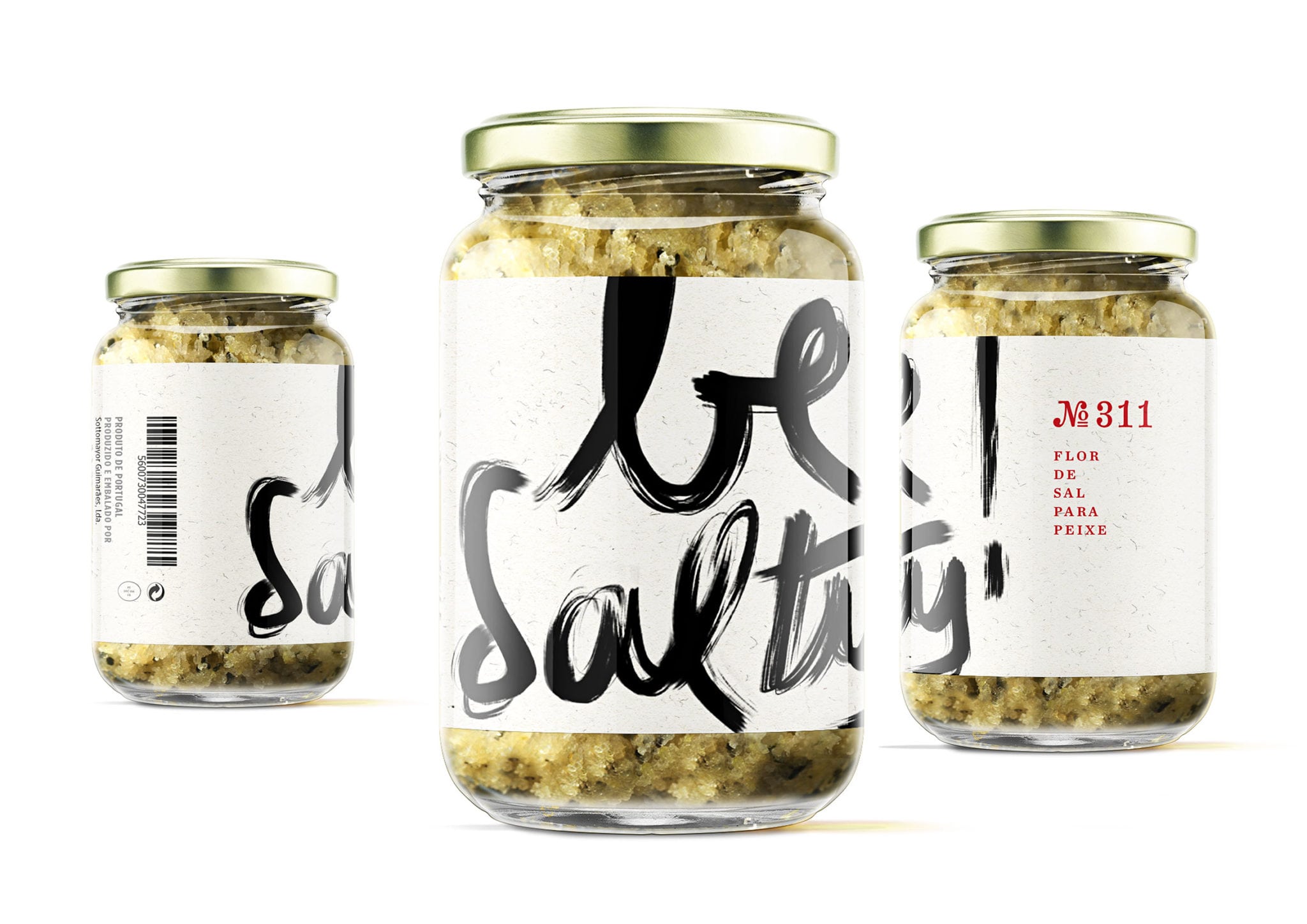
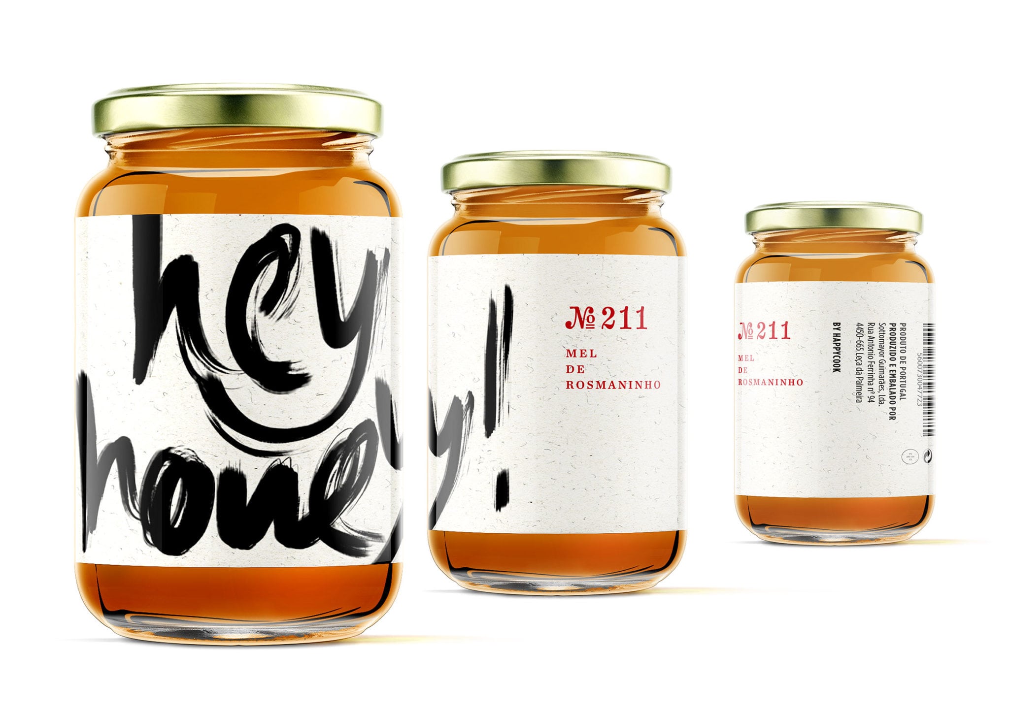
Happycook is a fresh homemade meals Portuguese brand. The studio was asked to design a low budget packaging for 20 new gourmet products — including jam recipes — in a different visual approach from previous released products.
The fist main design demand was to create a strong and emphasising label identity so every product would standout from the shelves, aiming for a rupture with traditional visual language used for gourmet products.
The concept was to humanise the labels so they could “talk” to an audience in a curious and captivating way, exploring street-vernacular expressions.
The products were organised in four main categories so it was possible to associate a label’s expression to its content: “Hey honey!” for honey; “Jam me!” for jam; “Be salty!” for salt; “Shinin’on!” for olive oil.
Main messages were digitally handwritten as if they were draw with jam or honey, sliding around the label.